Simplifying onboarding in digital banking—one screen at a time.
Designing a fast, low-friction onboarding experience for deposit accounts—focused on low to medium-risk customers—by simplifying product selection and application questions for instant account activation.

Toronto, Canada
1961
Finance
$26 billion (2024)
40,000+
Challenge
In today’s fast-paced digital banking landscape, the account opening process needs to be smooth, intuitive, and tailored to user expectations. For low to medium-risk customers, friction often arose during the early stages—especially when selecting products and completing application questions. The existing flow needed a redesign to reduce drop-offs, simplify decision-making, and create a more satisfying experience that encourages successful account openings.
Goals
Create an effortless user experience with intuitive navigation
Deliver a product recommendation within the first 5 minutes
Enhance personalization through customized communication
Provide continuous guidance and support throughout the customer journey
Streamline the application process to be completed within 15 minutes
Results
Post-redesign, user engagement significantly increased with a 25% reduction in task completion time and a 30% decrease in user error rates. User satisfaction ratings improved from 3.2 to 4.6 stars. The streamlined workflows and modern interface resulted in a 20% increase in new account creations within the first six months of the launch.
35%
Improved onboarding process
25%
Increase in user retention
84%
Decrease in time spent completing application


Process
Our design process follows a dual-track agile methodology, where we simultaneously conduct user research and concept testing (Discovery track) alongside iterative prototyping and usability improvements (Delivery track). This approach enables us to validate design choices early and continuously refine the product based on real-time feedback and evolving user needs.
Understand: We kicked things off with user interviews, surveys, and a deep dive into existing data to uncover what was frustrating users. We also looked at competitors and industry benchmarks to see how others were solving similar problems
Define: With the research in hand, we defined both primary and secondary user personas and mapped out the current user journey to highlight major pain points and opportunities.
Ideate: Knowing how complex and overwhelming digital onboarding can be—for both customers and branch staff—we explored different future states through detailed user flows. This helped us visualize a smoother, more intuitive experience.
Design: As the lead designer, I started with quick paper sketches to get ideas flowing, then moved into low-fidelity wireframes in Figma to communicate those ideas to the team. After a few rounds of feedback and iteration, I translated everything into high-fidelity designs and an interactive prototype.
Test: Once the high-fidelity prototype was finalized, we used Maze to test it with real users. Their feedback gave us the insights we needed to fine-tune the experience before handing it off to development.
Target Audience
Our target audience consists of new retail banking customers with low to medium risk profiles that live in the Caribbean mainly Barbados and Jamaica. They seek a quick, hassle-free process for opening deposit accounts. They value efficiency, personalised recommendations, and continuous support throughout their digital onboarding experience.
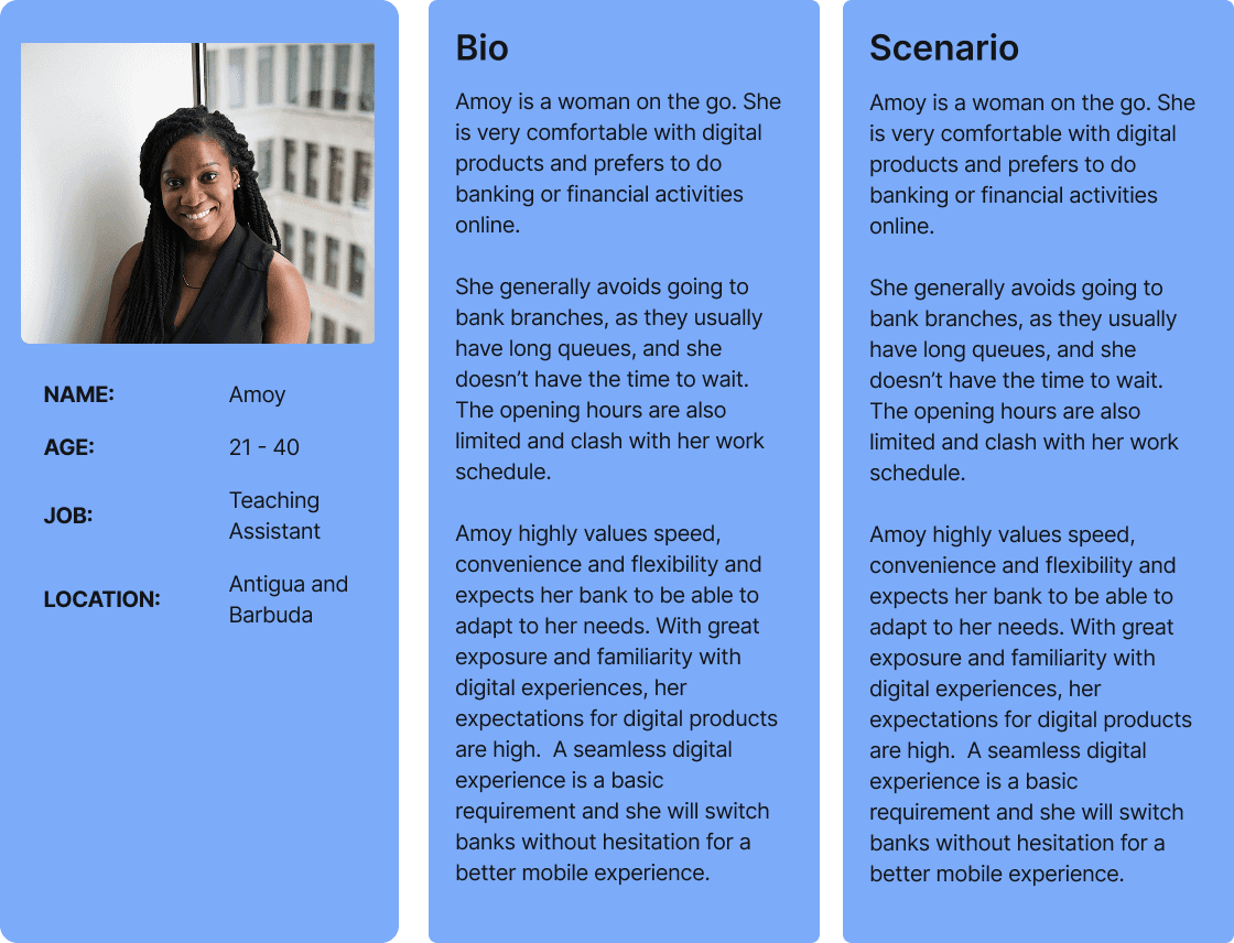
Primary Persona
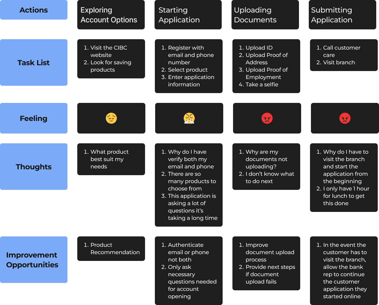
User Journey Map
Design Reviews
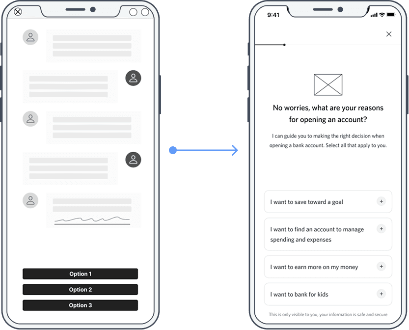
After reviewing with the low fidelity screens with the design team, we decided on incorporating a progress tracker to enhance clarity during the application process and using a conversational tone to create a more human-centered customer experience.
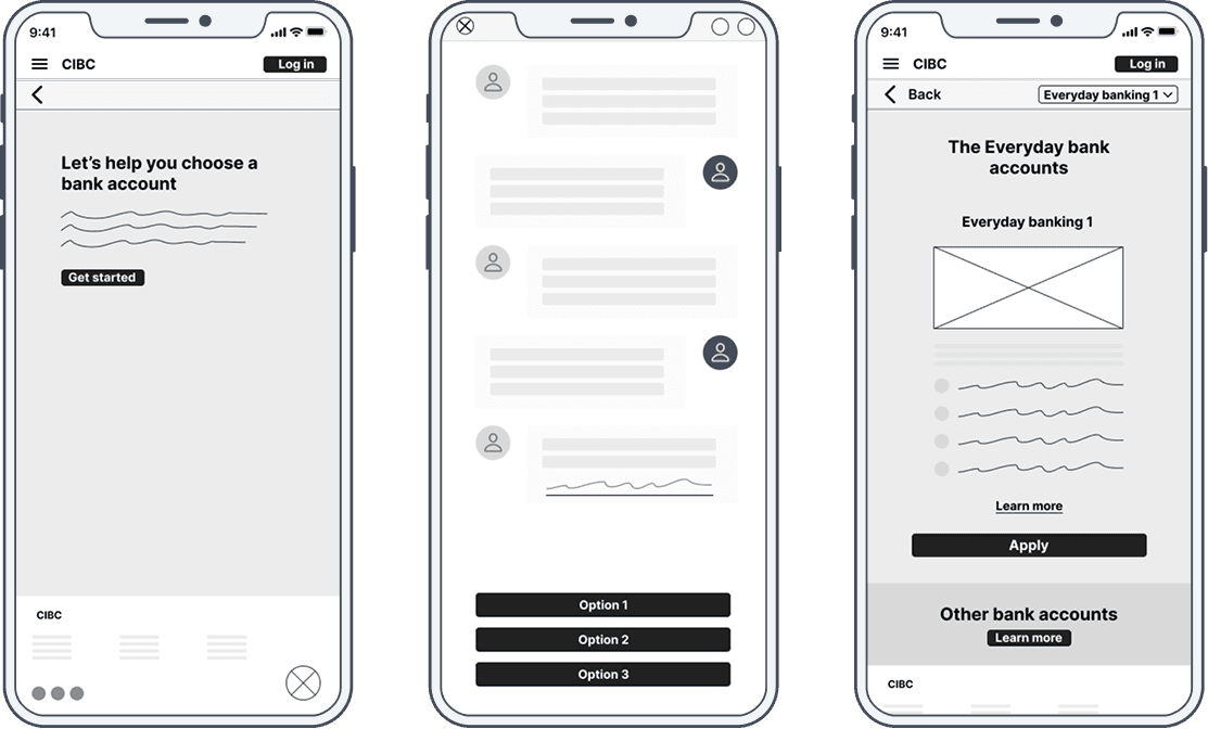
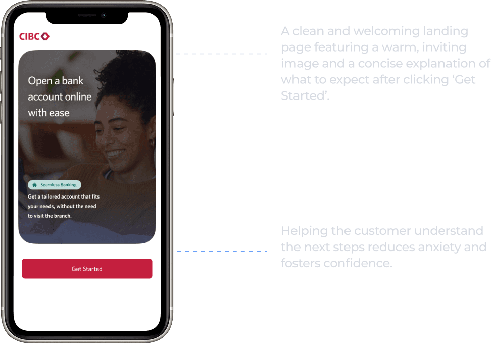
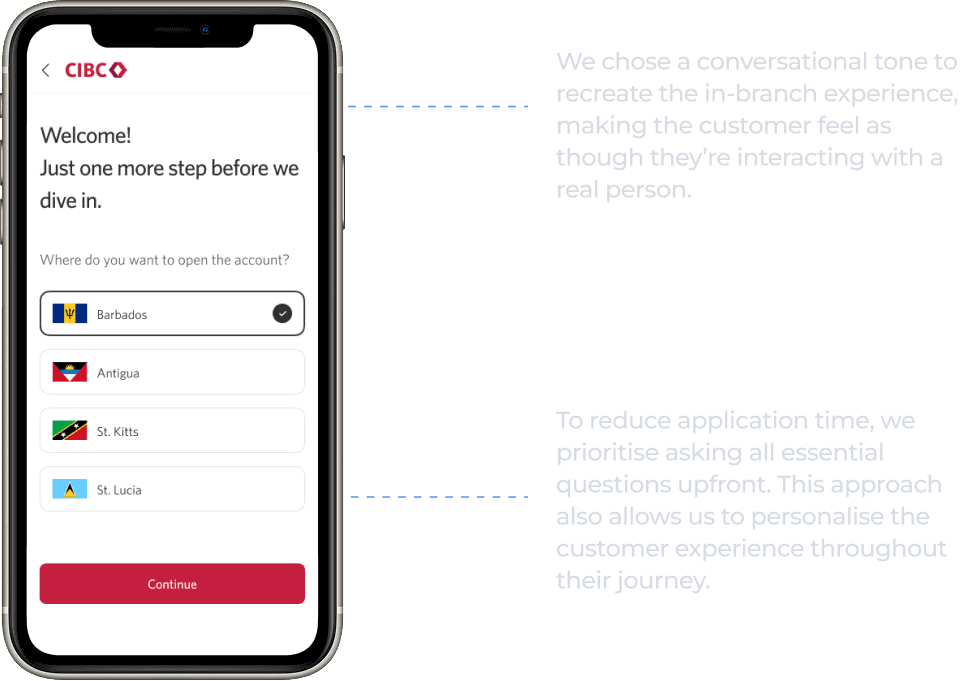
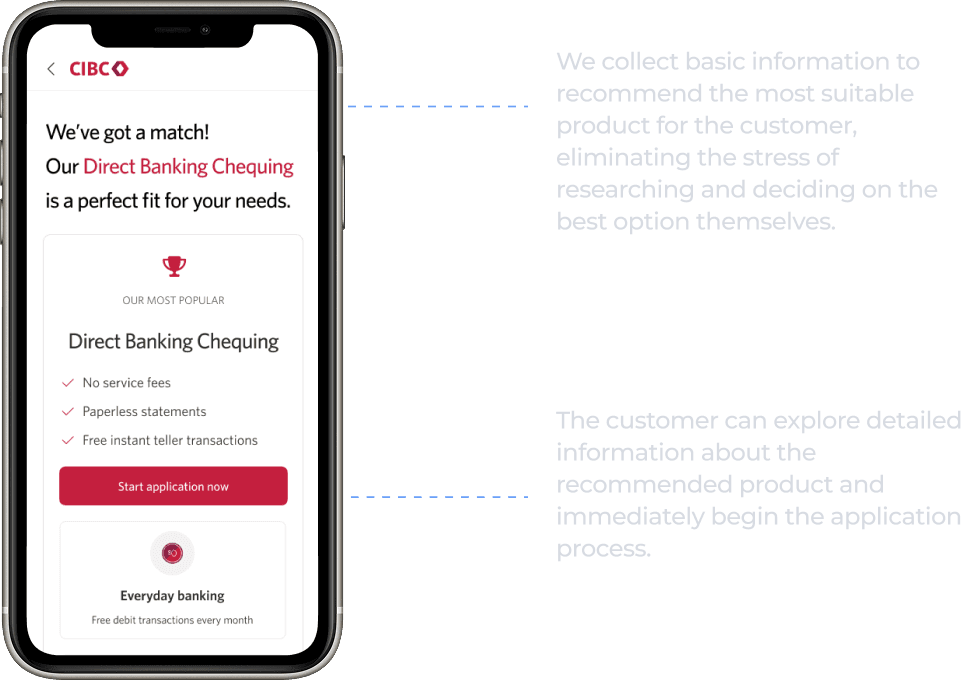
High Fidelity Screens
Key Takeaways
User-Centered Design Enhancements: By implementing features like a progress tracker and a conversational tone, we improve user engagement and reduce onboarding friction, making the process more intuitive and friendly.
Efficient Onboarding Flow: Streamlining the onboarding flow to complete within 15 minutes and including features like instant product recommendations aligns with customer needs for a fast and personalised experience.
Importance of Personalised Communication: Customised messaging and product suggestions help users feel understood and valued, increasing satisfaction and retention rates.
Continuous Guidance and Support: Real-time assistance tools, such as FAQs and live chat, address user pain points effectively, reducing drop-off rates by helping users navigate the application smoothly.
Data-Driven Decisions: The project used insights from quantitative and qualitative research to identify user pain points and prioritize features, ensuring that design choices directly address real user needs and behaviors.